I’m a designer, art director, writer, and illustrator.

Primarily, I’m an explainer.

Over the years, I have designed thousands of visual pieces for hundreds of companies— all hungry to stand out.  

The common thread? Every client has their own brand of a serious problem to solve. My approach is simple—find the most essential idea and communicate it with authenticity, enthusiasm and wit to those who stand to benefit.


Positioned to succeed. In 1987, a little company called Trimble Navigation was pioneering a new technology called GPS (Global Positioning System). They initially made a device for wealthy yacht owners but in the following five years grew into the survey, aviation, military and consumer markets. We designed over 150 pieces of collateral and advertising including the company's first two annual reports in 1990/91. For six years we created a brand based on educating audiences on the potential of a technology that would redefine location accuracy. We wrote and published GPS-A Guide to the Next Utility—a book that would eventually become the layman's manual for this revolutionary technology. We coined the phrase 'GPS-the ninth utility’ in predicting its future in our daily lives. Today, GPS is indeed a part of our daily lives, at virtually no cost to the user.

1

Knowledge is power. Symantec takes ownership in the PC market by predicting the ubiquity of the personal computer. The book was written and illustrated with such simplicity and clarity as to make the theory completely logical and believable—the…
 

2

Positioned to succeed. In 1987, a little company called Trimble Navigation was pioneering a new technology called GPS (Global Positioning System). They initially made a device for wealthy yacht owners but in the following five years grew into t…
 

3

A, B, see. Critter typeface, Adobe. Initially designed as a kid's book, these living letters caught the eye of Adobe and was converted into an everyday typeface in 1991. In 2013 I redesigned each of the characters for an Adobe pop-up store printing …
 

4

Beep, Beep. Brochure introducing Kia Motors to the U.S. consumer market. Positioned the Korean car manufacturer as a ‘people’s’ car for under $9,000. The copy was particularly conversational and self-effacing including the cover headline, “What the …
 

5

Sticky design. US Postal Service stamps designed to make an envelope lovely. Worth every cent.
 

6

Return of the mascot. LucasArts trademark. Designed in 1991 for George Lucas' entertainment and gaming company. Initially drawn with a spackling knife and paint, the character intended to avoid the sameness of slickly produced vector design that was…
 

7

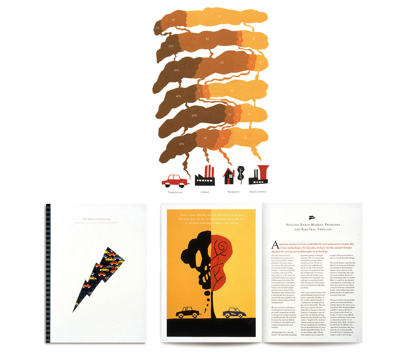
Pollution stinks. The Energy Foundation Annual Report 1995. The Energy Foundation is a non-profit organization that at the time was spearheading the scientific discussion about air pollution and the measures necessary to put electric cars into play.…
 

8

Pull up a chair. Steelcase consumer ad campaign (16 ads). Steelcase was repositioning itself from being a trade-only manufacturer to a consumer accessible retailer. As a heavyweight manufacturer amongst the interior design profession, Steelcase…
 

9

Posters for San Francisco Ballet, Mill Valley Film Festival, Steppenwolf Theatre, Fillmore Jazz Festival.
 
Realm Cellars. Limited edition wine labels and packaging. Numbered and ridiculously expensive.

10

Good going. Goodwill San Francisco rebrand 2012-present. Goodwill had long suffered a reputation of being a second-hand store for the thrifty when in fact it is much more. Studies indicated that people didn't know you could get good appliances, tool…
 

11

Problem fixers. In 2003, a small Chicago consulting firm called Navigant was in need of a visual identity in a business drowning with photographs of businessmen with brief cases shaking hands. My style of thinking (and illustrating)resonated with se…