Design with purpose.
Purpose to create interest, understanding, and trust between you and your customers.
It’s that simple.
US Postal Service

Sticky design. US Postal Service stamps designed to make an envelope lovely. Worth every cent.
DuMOL Winery

The craft of luxury. I created everything from a label rebrand, to anniversary wines, packaging, NY Times advertising, posters, signage, and a newspaper journal. Winemaking—especially in the luxury category—is very serious and the competition is fierce. Where the industry tendency is to gold foil everything and say “we make the best wine,” I moved DuMOL toward an accessible, more authentic brand of communication. Our belief was that consumers like the stories and the people behind the wine as much as they like the wine—and in the end, the primary differentiators are the tone of the our voice and our visual language. For 16 months, we produced 5 editions of The DuMOL Dirt—a breakout publication designed to describe the complex process of winemaking from the valley fog to harvest to French barrels—each with just enough detail, spice, and humor to make them collectable.
Lundberg Spirits
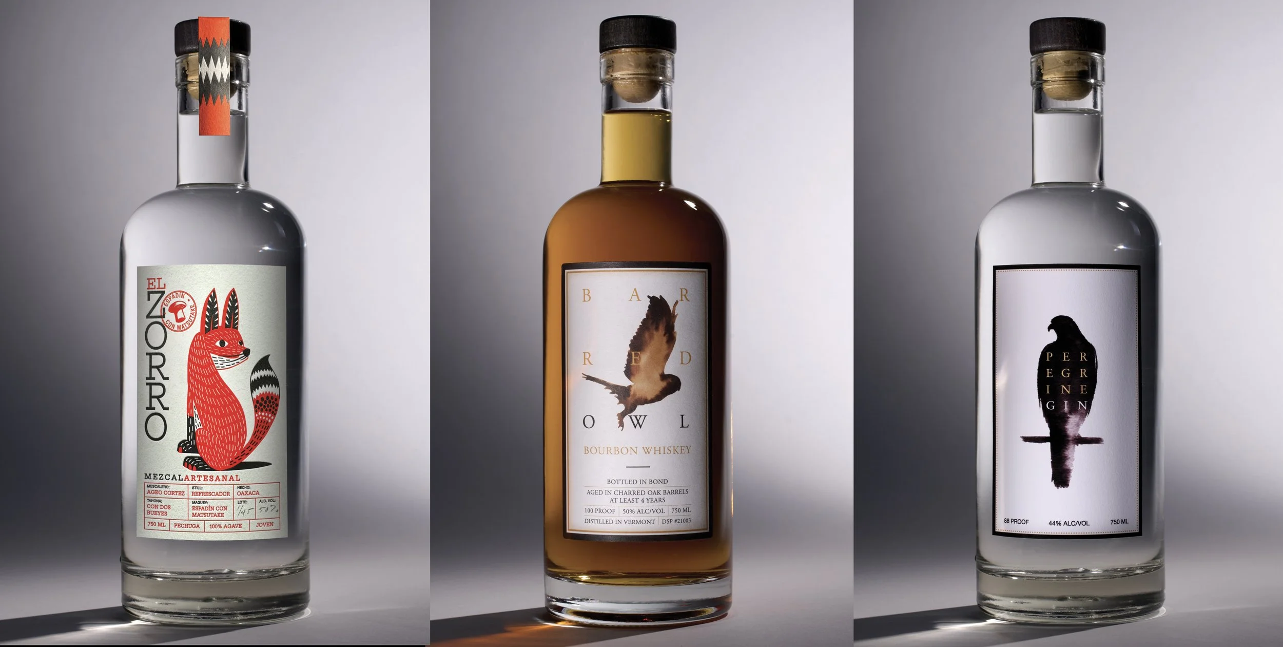
Spirits in the night. Small batch suite of spirits. The gin and bourbon were designed to be birds of prey, but when the mescal came along we kept with a creature but celebrated the carved wood animals (Alebrijes) of Oaxaca—El Zorro (fox). Lundberg Spirits.
Nutrex

Farm to Health. Nutrex manufactures two products farmed from the waters of the big island of Hawaiʻi. Both products were in need of dramatic redesigning to compete in the crowded health supplement category. As both Spirulina and BioAstin products are produced elsewhere in the world by less pure means, it was important to stress that these products are produced in a one-of-a-kind location with methods that are unreplicable by competitors. In other words—accept no substitutes. We developed a seal that was employed not only on the packaging but ads and promotion certifying the authenticity of the product’s origin. The second key attribute to the redesign was to convey a Hawaiian gestalt that spoke to the company’s heritage since 1984.
23andMe

Nothing to spit at. Whereas 23andMe represents a new paradigm in personal health inquiry and knowledge, their communications (website and advertising) lacked an accessible tone and voice. We consulted with the company on the use of visuals and messaging—with particular emphasis on leveraging their visual identity.
Navigant

Problem fixers. In 2003, a small Chicago consulting firm called Navigant was in need of a visual identity in a business drowning with photographs of businessmen with brief cases shaking hands. My style of thinking (and illustrating) resonated with senior management in their hunt to stand out. In an industry of abstract products and services, my illustrations served to build a visual brand that staked their claim to ‘thinking differently’. Over the following 13 years Navigant would have one of the most recognized and provocative brands in the consulting business. As both an illustrator and design consultant, I built a visual library of over 75 images and icons that served 11 distinct vertical business divisions worldwide. I created visuals and consulted on how to use them across all media. A public company since 2008, Navigant has been known as the company with the ‘little-headed guy in strange predicaments’. Amongst 9 annual reports, Fortune magazine covers, ads, and hundreds of brochures and web pages—my illustrations reached thousands of business men and women with a 3-year campaign on the walls of O'Hare Airport. My images not only branded Navigant in the minds of their core constituency, but renamed Terminal C as Terminal Navigant.
Trimble Navigation

Positioned to succeed. In 1987, a little company called Trimble Navigation was pioneering a new technology called GPS (Global Positioning System). They initially made a device for wealthy yacht owners but in the following five years grew into the survey, aviation, military and consumer markets. We designed over 150 pieces of collateral and advertising including the company's first two annual reports in 1990/91. For six years we created a brand based on educating audiences on the potential of a technology that would redefine location accuracy. We wrote and published GPS-A Guide to the Next Utility—a book that would eventually become the layman's manual for this revolutionary technology. We coined the phrase 'GPS-the ninth utility’ in predicting its future in our daily lives. Today, GPS is indeed a part of our daily lives, at virtually no cost to the user.
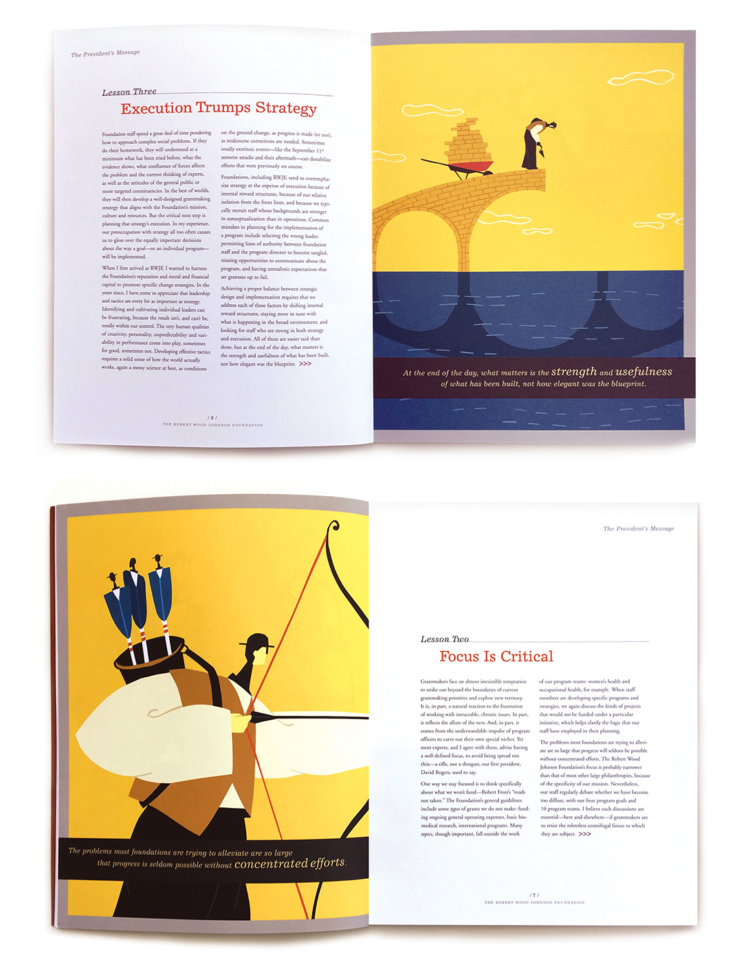
Trust Magazine
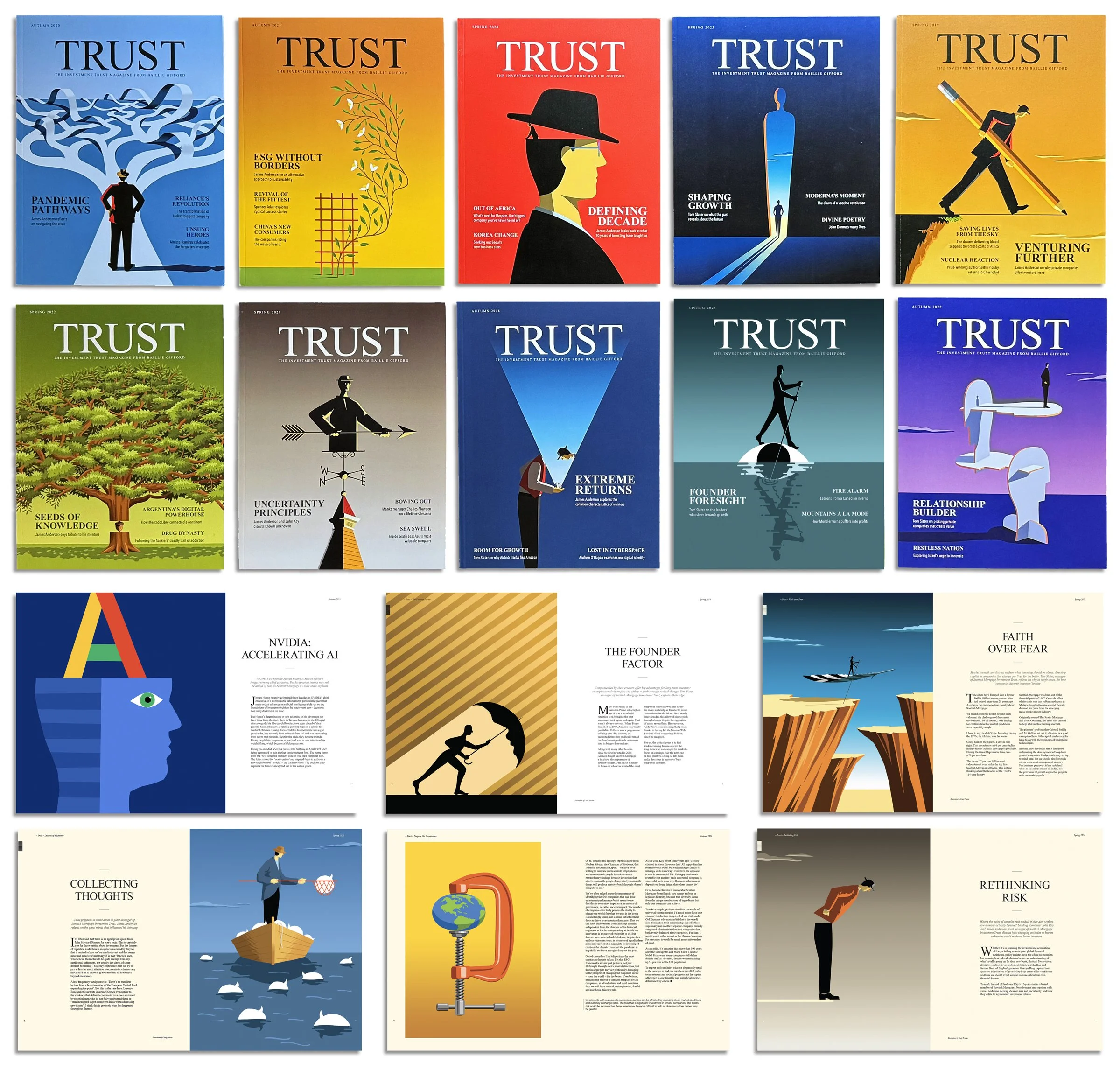
Trusted contributor. The Scottish investment firm Baillie Gifford produces a semi-annual printed magazine for its investors and prospects. The magazine features articles by their investment managers and other thought leaders in the financial community. Over a 5-year period I created illustrations for 11 covers and 36 interior articles. Subjects ranged from risk management, energy, AI, founders, cyberspace, climate change, relationship building, pandemics, and myriad articles on all facets of investing. Like the masthead, the client invested tremendous trust in my ability to create interest and understanding of articles of great complexity and often highly abstract.
Marks


Santa Cruz Guitar

Made by hand. The Santa Cruz guitar Company is one of a few companies that employs master luthiers and makes their guitars one-at-a-time to custom specifications while their customers wait up to a year in line. This 40-year old company makes their instruments much like violin makers make theirs—with every effort to create a legacy instrument that transcends the standards of mass manufactured instruments. Over the years, I have designed posters and ads that celebrate the rarified space that they occupy in the world of high-technology and mass production. Their instruments are beautiful to hear and to see. I have even designed a custom 'songbird' inlay available for special order.
Marketing by education. Santa Cruz' guitar-making process takes one-hundred plus steps that we have condensed to twenty-eight events that have been described in great detail through word and pen-and-ink drawings. (book in progress) The book serves to pull back the curtain on the artistry and craftsmanship that comprise the rigorous standards that make their guitars sought after worldwide by amateurs and professionals the likes of Brad Paisley, Elvis Costello, Eric Clapton, David Crosby and Don Edwards to name just a few. The principle is that the more a customer knows about their instrument, the more they love it and the more they promote it to others. Santa Cruz has an enormous fan base and there is no better salesperson than a satisfied (and educated) customer.
Steelcase

Pull up a chair. Steelcase consumer ad campaign (16 ads). Steelcase was repositioning itself from being a trade-only manufacturer to a consumer accessible retailer. As a heavyweight manufacturer amongst the interior design profession, Steelcase had a lot of work to do to establish a reputation to the actual customers that sat in their chairs. We mounted a 3-year campaign in trade and consumer publications that focused on people as much as furniture and told real stories about products, service and design. The ads didn't look like ads at all. They were designed with stark simplicity—elegant photographs, sparing large type and no ad hype. This sat very well with their new customers.
Symantec

Knowledge is power. Symantec takes ownership in the PC market by predicting the ubiquity of the personal computer. The book was written and illustrated with such simplicity and clarity as to make the theory completely logical and believable—they were right! Keep in mind, this was 1997! Symantec Annual Report 1997.
Goodwill, SF

Good going. Goodwill San Francisco rebrand 2012-present. Goodwill had long suffered a reputation of being a second-hand store for the thrifty when in fact it is much more. Studies indicated that people didn't know you could get good appliances, tools, books and sports equipment—or that it was a good place to donate such goods. With a fleet of 50 trucks they had billboards on wheels. With 9 different messages and a catalogue of 100+ custom icons, we were able to feature the wide variety of goods available—both repositioning Goodwill as a viable retail outlet and inspiring donors to donate things they would have not otherwise.
The Energy Foundation

A better car. The Energy Foundation Annual Reports 1995 and 1996. The Energy Foundation is a non-profit organization that at the time was spearheading the scientific discussion about air pollution and the measures necessary to put electric cars into play. The piece was written by and intended for thought-leaders and policy-makers. There were no punches pulled in the portrayal of dismal information. It is clear that they made a convincing argument for change.
Illustration


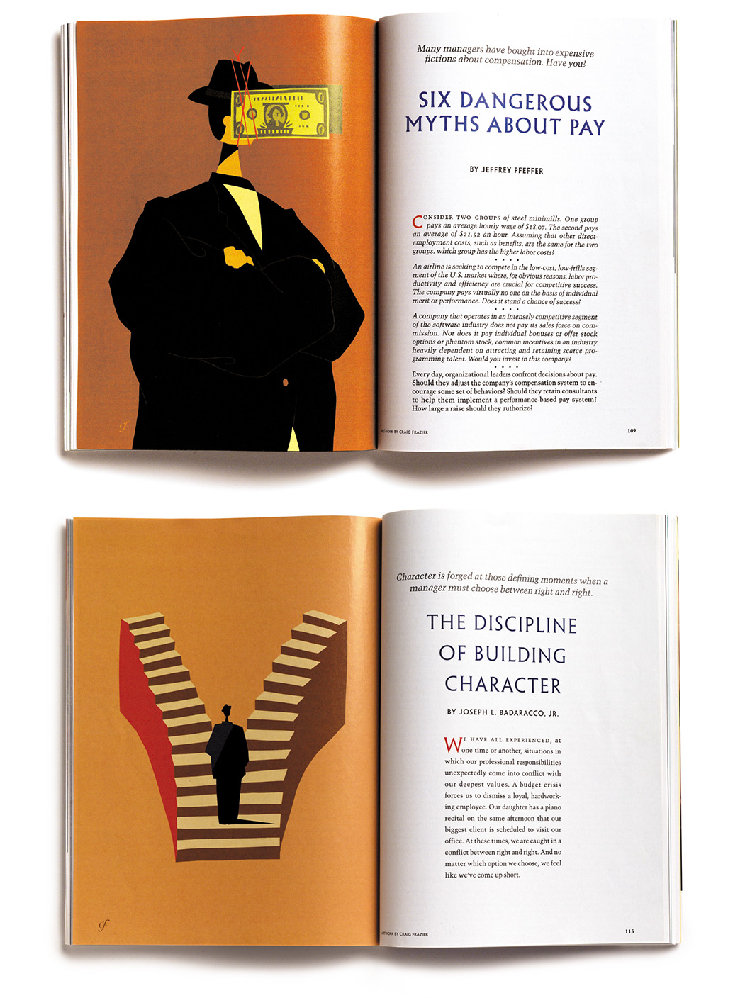


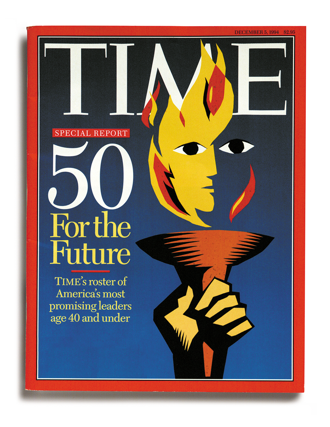


Illustrated voice. With regular frequency, and short deadlines, I'm asked to help publications, companies and organizations illustrate their messages. Clients such as Time, The Wall Street Journal, The New York Times, Harvard Business Journal, The Robert Woods Foundation, The Whitehead Institute, and Aidswalk, to name a few.